artwork
SortType font aug-sept 2025 | CC BY 4.0
go back to works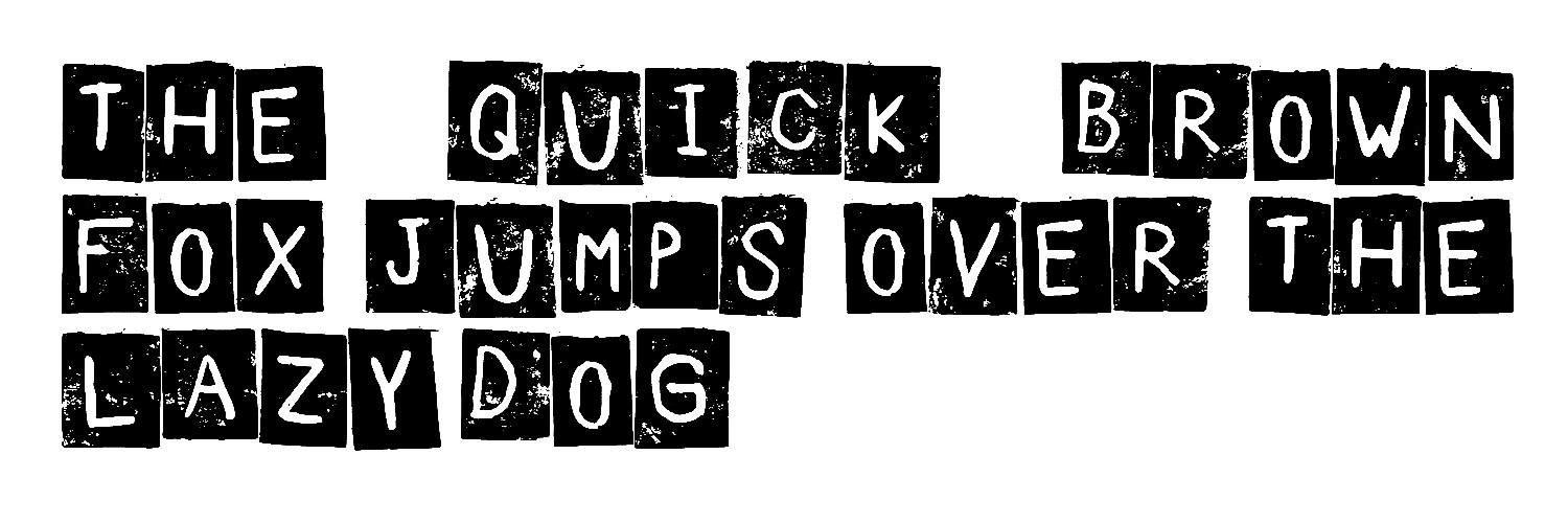
how was this font made
last summer, i became fascinated by the idea of printing using various materials and techniques, such as erasers, plastic, and more.
when i visited the school, i experimented with the equipment available there, specifically linoleum [1]. i hand-carved 90 small letters - lowercase print letters measuring about 2 by 2.5 cm - and began experimenting with them.
i tried different inks and printing surfaces and created finished graphic works using these letters.
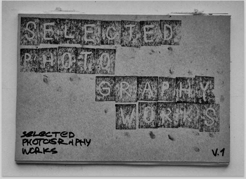
i liked the idea of using them for headlines or titles in some of my projects, such as the cover of a book i personally bound called
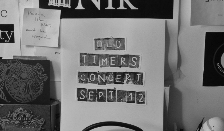
Selected Photography Works [2]. later, I found further applications for these letters in graphic design and created a series of works for
the Letovo Music Community [3].
then, the idea came to me to create a digital font from these letters,
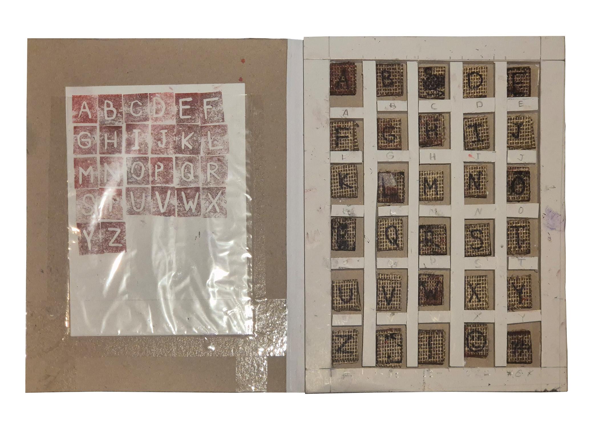
so it could be used in graphic editors for future designs. my first attempt involved scanning the pages of one of my books, then
cutting out letters from the scans of the prints to make the font.
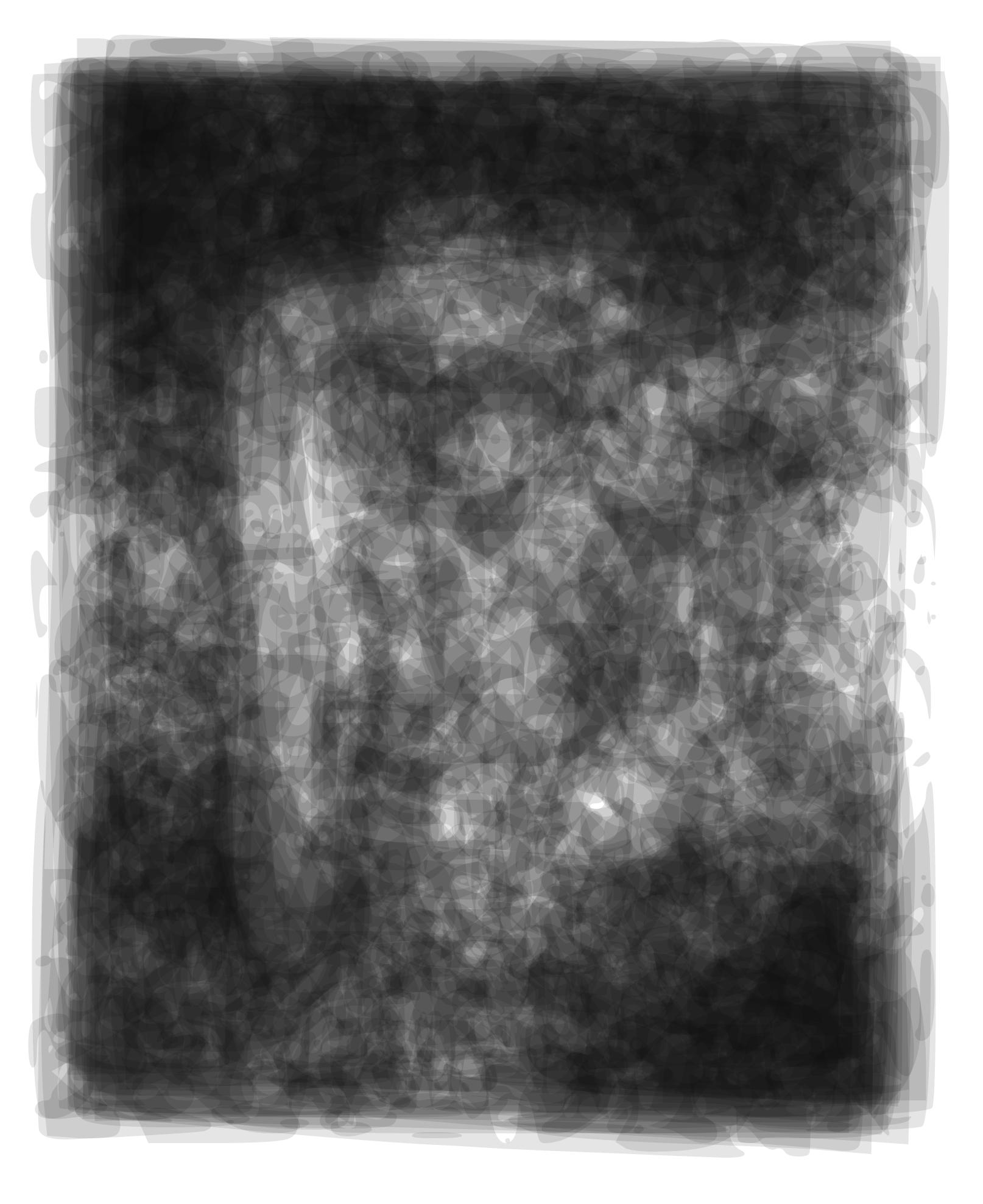
although I managed to create the font, it was very hard to read - words
set in this font were unclear. so I decided to repeat the process.
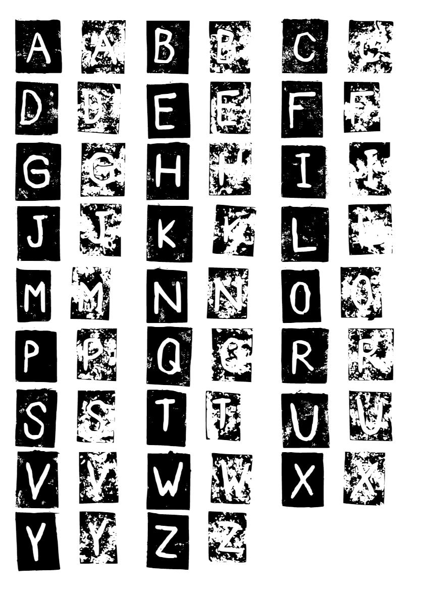
the second time, i used a different ink and technique.
while the first time i simply painted the printing surface of the letters
with acrylic paint, this time i used watercolor combined with a special technique I developed through trial and error. as a result, i produced two sheets with at least three prints of each latin letter. i scanned these sheets and repeated the font-creation process from my first attempt.
eventually, I achieved an ideal font: the uppercase letters (ABC) became denser, "filled-in," and highly readable, while the lowercase letters (abc) retained the texture and patterns of my first attempt but were less readable. once i completed the font, i started considering its usage contexts. i was drawn to the idea of using it in social advertising to raise awareness about dementia. i designed a poster where a person narrates their life, but what they cannot remember due to the illness is written in the less-readable version of the font.
i was very pleased with the result.
last summer, i became fascinated by the idea of printing using various materials and techniques, such as erasers, plastic, and more.
when i visited the school, i experimented with the equipment available there, specifically linoleum [1]. i hand-carved 90 small letters - lowercase print letters measuring about 2 by 2.5 cm - and began experimenting with them.
i tried different inks and printing surfaces and created finished graphic works using these letters.
i liked the idea of using them for headlines or titles in some of my projects, such as the cover of a book i personally bound called
Selected Photography Works [2]. later, I found further applications for these letters in graphic design and created a series of works for
the Letovo Music Community [3].
then, the idea came to me to create a digital font from these letters,
so it could be used in graphic editors for future designs. my first attempt involved scanning the pages of one of my books, then
cutting out letters from the scans of the prints to make the font.
although I managed to create the font, it was very hard to read - words
set in this font were unclear. so I decided to repeat the process.
the second time, i used a different ink and technique.
while the first time i simply painted the printing surface of the letters
with acrylic paint, this time i used watercolor combined with a special technique I developed through trial and error. as a result, i produced two sheets with at least three prints of each latin letter. i scanned these sheets and repeated the font-creation process from my first attempt.
eventually, I achieved an ideal font: the uppercase letters (ABC) became denser, "filled-in," and highly readable, while the lowercase letters (abc) retained the texture and patterns of my first attempt but were less readable. once i completed the font, i started considering its usage contexts. i was drawn to the idea of using it in social advertising to raise awareness about dementia. i designed a poster where a person narrates their life, but what they cannot remember due to the illness is written in the less-readable version of the font.
i was very pleased with the result.
^ set of linoleum letters i used for printing
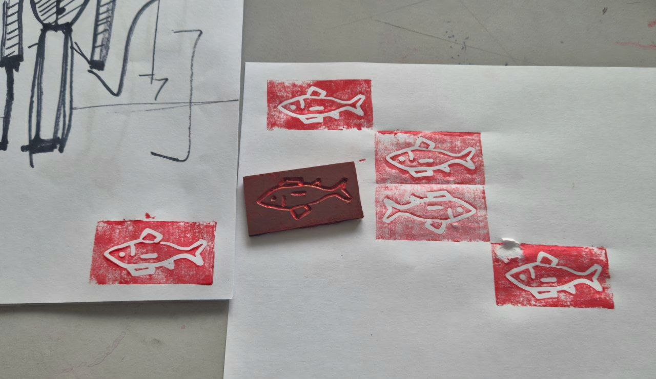
^ [1] Stamp of fish from linoleum I made as a test
^ [2] Front cover of Selected Photography Works in SortType
< [3] Old Timers Concert poster for
Letovo Music Community in SortType
Letovo Music Community in SortType